5 Most Common Landing Page Mistakes
In today’s business world where companies and firms have moved online, a website plays a key role in determining its success or failure. You can only imagine the amount of money a business will lose if it shuts down for several hours. It is therefore given that any organization should own a website.
Beyond this, the landing page of your website, can either keep your customers or chase them away. The landing page according to Orbitmedia, “is the page that satisfies the informational needs of the customer.” For example, let’s say potential customer searches for headphones, get the results, clicks one of them and it takes the customer to your website. It is expected that the content of the page is related to headphones. If the opposite is the case, the customer will definitely be put off and you will lose them.
It is advisable for your website to be fully optimized to direct customers to the landing page rather than the home page. Correspondingly, there are so many mistakes associated with the landing page. We discuss and highlight the five most common ones.
Slow website speed
Whatever purpose you are using your website for, the speed can help convert customers. Research shows that if a page does not load within five seconds, your customers are most likely to move on to the next page. This is because most people do not have the patience for a page to load as they have a variety of options. From time to time, you need to test your website’s speed. This is the same for landing page because if the website is slow, it will automatically affect the landing page. The conversion will be improbable which is what you actually want. You can use Pingdom or Google’s PageSpeed Insights to test the speed of your website on both desktop and mobile.
Poor call-to-action
Call-to-action is used to encourage a quick sale. It may seem irrelevant or not very important but the words you use to call your visitors to patronize your service is key. The words must be specific and must address the needs of the customer. Verbosity should be avoided because overtly used words or description is a put off for most people. And if you use a button for this purpose, it must be unique. Additionally, the design of the call to action should be considered especially if you are using a button. The background of your website must not overshadow the color. Endeavor to employ contrast as it might also help.
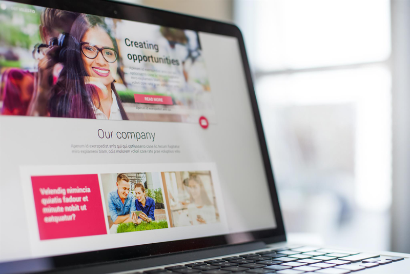
Absence or immaterial pictures
Grabbing the attention of website visitors have a monumental impact on converting them. A significant way to get this privileged awareness is to use images of your product or service that are clear, crisp and have a very high resolution. It will captivate them. However, a crime or mistake that should be entirely avoided is using pictures or using irrelevant ones. This is one of the best ways to chase your visitors away. The rule of thumb is if the picture is not of quality, never use it. This not only makes you lose customers, but the perception or imprint that will be left in the minds of the customer is also that you are unprofessional. A serious organization will not use such pictures.
Ignoring optimizing your landing for mobile
A smartphone is nothing new in the modern tech world. As smartphones are now available, internet penetration has increased. Smartphones and the internet are now a part of our lives, and you can barely do anything without them. The attachment to mobile phones has gotten to a point where smartphone users are diagnosed with what is known as nomophobia. Hence, it is very possible that your website visits or traffic will emerge from mobile phones.
This said a major mistake you can make is optimizing your landing page for desktop and ignoring mobile. You may be losing a healthy chunk of your customers. Know the small difference between optimizing a landing page for desktop and mobile to solve this. Employing a good mobile marketing agency could certainly help your mobile optimization, but you can also do a few things to help; such as limit your headlines to only five words, add your firm’s design logo and do not forget to use a simple, attractive and sophisticated design. Finally, include the call-to-action and make it as pungent and brief as possible.
Your landing page is complicated
Everything about your landing page is complicated. From the forms to the language and the design employed; they are all complicated. This will make your landing page very difficult to navigate. The more the difficulty, the more the reduction in sales and this results in the loss of customers. Afterward, turnover will be affected. To solve this, have clear instructions on how to navigate your landing page, keep language short and straightforward, endeavor not to overload the page with too much information or designs.
Also, make sure that whatever information you are offering to the customer is what they asked for. If you can, add reviews or endorsements from customers who have previously used your product. This will guarantee the potential customer that people are actually using your product and it is serving the purpose it is meant. Summarily, make things on your website seamless as this will prompt visitors to stay on your website and actually use your service. If they are happy, they will come back.
Conclusion
The landing page is like the unique selling point of a website. The more it is optimized, the better for your inbound traffic. Accordingly, you should always monitor your landing page in case something awry goes wrong. If it is not optimized, you should check for the mistakes/flaws and immediately correct them. A business is not established for charity purpose. It is to make as much money and turnover as possible in order to keep it running and address overheard costs. Your landing page can help you achieve this.